plot_barh_chart()
Plots a horizontal bar chart in the Economist style. Best for comparing 2–10 categories with long text labels. Horizontal orientation allows labels to be read naturally left-to-right.
Quick Example
import pandas as pd
import clean_charts as cc

df = pd.DataFrame({
    "Country": ["Finland", "Denmark", "Iceland", "Israel", "Netherlands", "Sweden"],
    "Happiness Score": [7.80, 7.58, 7.53, 7.47, 7.40, 7.39]
})

cc.plot_barh_chart(
    data=df,
    title="The World's Happiest Countries",
    subtitle="World Happiness Report 2024 (Top 6)",
)
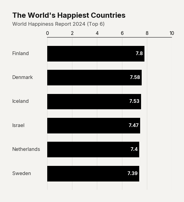
Example output for Barh.
Data Requirements
The input data must be a pandas.DataFrame with exactly two columns:
- Column 0 — Category labels (
str) - Column 1 — Numeric values (
floatorint)
Rows are displayed in the exact order they appear. Sort your DataFrame before plotting to achieve ranked charts.
Parameters
| Parameter | Type | Default | Scope | Description |
|---|---|---|---|---|
data |
pd.DataFrame |
Built-in | Common | 2-column DataFrame: [Category labels, Values]. |
output_path |
str | None |
None |
Common | File path to save the chart. Displays inline if None. |
width |
int | None |
Auto | Common | Image width in pixels. |
height |
int | None |
Auto | Common | Image height in pixels. |
aspect_ratio |
str | None |
None |
Common | "square", "landscape", "vertical", "1:1", "2:1", "1:2". |
title |
str | None |
None |
Common | Bold header text (auto-wrapped). |
subtitle |
str | None |
None |
Common | Secondary text below title. |
bg_color |
str | None |
"#f4f3f0" |
Common | Background hex color. |
scale_text |
bool |
True |
Common | Scale fonts proportionally with image size. |
value_suffix |
str |
"" |
Common | String appended to value labels (e.g., "%", "M"). |
show_percentages |
bool |
False |
Common | Format values as percentages. |
color |
str |
"#000000" |
Unique | Hex color for all bars. |
bar_padding |
float |
0.35 |
Unique | Fraction of bar slot left as gap between bars (0–1). Higher = thinner bars. |
Common Scenarios
Minimalist Ranking
Ultra-thin bars for dense reports where the text hierarchy matters more than the bars:
df = pd.DataFrame({
    "City": ["Vienna", "Copenhagen", "Zurich", "Melbourne", "Calgary", "Geneva"],
    "Index Score": [98.4, 98.0, 97.1, 97.0, 96.8, 96.8]
})
cc.plot_barh_chart(
    data=df,
    title="The World's Most Livable Cities",
    subtitle="Global Livability Index 2024",
    bar_padding=0.6,
    color="#000000",
    value_suffix=" pts",
)
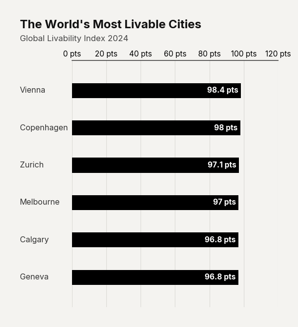
Example output for Barh.
Percentage Labels
Show proportions instead of raw values:
df = pd.DataFrame({"Region": ["North", "South", "East", "West"], "Share": [45, 25, 20, 10]})

cc.plot_barh_chart(
    data=df,
    title="A widening regional divide",
    subtitle="The North captures 45% of the market, more than the East and West combined",
    show_percentages=True,
    color="#D0006C"
)
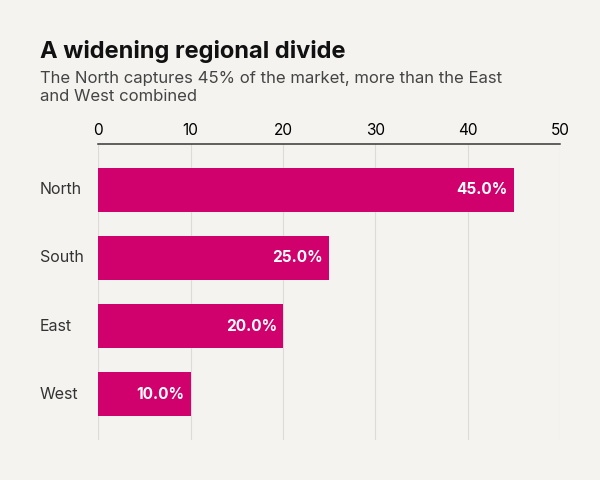
Example output for Barh.