plot_scatter_chart()
Plots a 2D scatter plot in the Economist style. Best for visualizing relationships, correlations, and distributions between two continuous variables.
Quick Example
import pandas as pd
import clean_charts as cc

df = pd.DataFrame({
    "Company": ["AAPL", "MSFT", "GOOG", "AMZN", "META", "TSLA", "NVDA", "JPM"],
    "Revenue Growth (%)": [8, 12, 15, 11, 22, 19, 45, 6],
    "Profit Margin (%)": [26, 37, 25, 6, 28, 12, 55, 33]
})

cc.plot_scatter_chart(
    data=df,
    title="Tech Giants Performance",
    subtitle="Revenue Growth vs Profit Margin",
    x_label="Revenue Growth",
    y_label="Profit Margin",
    x_suffix="%",
    y_suffix="%",
    show_labels=True
)
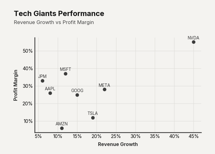
Example output for Scatter.
Data Requirements
- 2 columns — [X values, Y values]
- 3 columns — [Labels, X values, Y values] (labels used when
show_labels=True)
Parameters
| Parameter | Type | Default | Scope | Description |
|---|---|---|---|---|
data | pd.DataFrame | Built-in | Common | 2 or 3-column DataFrame. |
output_path | str | None | None | Common | File path to save the chart. |
width | int | None | 700 | Common | Image width in pixels. |
height | int | None | 500 | Common | Image height in pixels. |
aspect_ratio | str | None | None | Common | "square", "landscape", etc. |
title | str | None | None | Common | Bold header text. |
subtitle | str | None | None | Common | Secondary text below title. |
bg_color | str | None | "#f4f3f0" | Common | Background hex color. |
scale_text | bool | True | Common | Scale fonts proportionally. |
color | str | None | Auto | Unique | Hex color for scatter dots. |
dot_size | float | 80 | Unique | Marker size (area in points²). |
alpha | float | 0.75 | Unique | Transparency of scatter points (0.0–1.0). |
x_label | str | None | None | Unique | X-axis label text. |
y_label | str | None | None | Unique | Y-axis label text. |
x_suffix | str | "" | Unique | Suffix for X-axis annotations. |
y_suffix | str | "" | Unique | Suffix for Y-axis annotations. |
show_labels | bool | False | Unique | Annotate points with label strings. |
show_trendline | bool | False | Unique | Plot a linear regression trend line. |
trendline_color | str | None | None | Unique | Hex color for the trend line. |
Common Scenarios
Labeled Scatter with Trend
df = pd.DataFrame({
    "Company": ["AAPL", "MSFT", "GOOG", "AMZN", "META", "TSLA", "NVDA", "JPM"],
    "Revenue Growth (%)": [8, 12, 15, 11, 22, 19, 45, 6],
    "Profit Margin (%)": [26, 37, 25, 6, 28, 12, 55, 33]
})

cc.plot_scatter_chart(
    data=df,
    title="Growth vs Profitability",
    show_labels=True,
    show_trendline=True,
    trendline_color="#635bff"
)
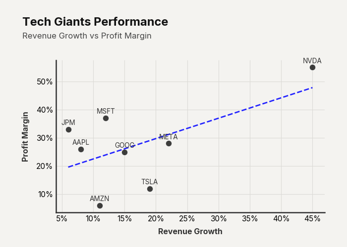
Example output for Scatter.