plot_dumbbell_chart()
Plots a horizontal dumbbell (range dot) chart. Best for comparing the same metric across two distinct time periods or groups — “before vs after”, “target vs actual”, “2022 vs 2023”.
Quick Example
import pandas as pd
import clean_charts as cc

df = pd.DataFrame({
    "Country": ["US", "China", "Germany", "UK", "India", "France"],
    "2010": [14.99, 6.09, 3.42, 2.48, 1.68, 2.65],
    "2023": [25.46, 17.79, 4.46, 3.33, 3.73, 3.05]
})

cc.plot_dumbbell_chart(
    data=df,
    title="GDP Growth by Country",
    subtitle="2010 vs 2023 (USD Trillions)",
    value_suffix="T",
    show_values=True
)
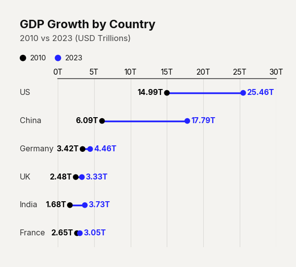
Example output for Dumbbell.
Data Requirements
Exactly 3 columns: [Category labels, Start values, End values].
Parameters
| Parameter | Type | Default | Scope | Description |
|---|---|---|---|---|
data | pd.DataFrame | Built-in | Common | 3-column DataFrame: [Category, Start, End]. |
output_path | str | None | None | Common | File path to save. |
width | int | None | Auto | Common | Image width in pixels. |
height | int | None | Auto | Common | Image height in pixels. |
aspect_ratio | str | None | None | Common | "square", "landscape", etc. |
title | str | None | None | Common | Bold header text. |
subtitle | str | None | None | Common | Secondary text. |
bg_color | str | None | "#f4f3f0" | Common | Background hex color. |
scale_text | bool | True | Common | Scale fonts proportionally. |
value_suffix | str | "" | Common | String appended to value labels. |
start_color | str | "#000000" | Unique | Hex color for the first-series dots. |
end_color | str | "#2323FF" | Unique | Hex color for the second-series dots. |
connector_color | str | Auto | Unique | Hex color for the connecting line. |
dot_size | float | Auto | Unique | Marker size area in points². |
show_values | bool | False | Unique | Display numeric value labels next to each dot. |
Common Scenarios
Target vs Actual
df = pd.DataFrame({
    "Product Line": ["Software Subscriptions", "Cloud Hosting", "Hardware Sales", "Consulting"],
    "Target": [150, 120, 85, 45],
    "Actual": [142, 135, 72, 48]
})

cc.plot_dumbbell_chart(
    data=df,
    title="Q4 Revenue Performance",
    subtitle="Target vs Actual revenue by product line (in Millions)",
    value_suffix="M",
    show_values=True,
    end_color="#FD8302",
    start_color="#0241FD",
)
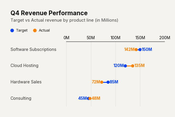
Example output for Dumbbell.
Sentiment Shift
df = pd.DataFrame({
    "Emotion": ["Joy", "Sadness", "Anger", "Fear", "Surprise"],
    "Previous": [12, 8, 5, 3, 6],
    "Current": [15, 6, 7, 2, 9]
})

cc.plot_dumbbell_chart(
    data=df,
    title="Brand Sentiment Shift",
    connector_color="#36404A"
)
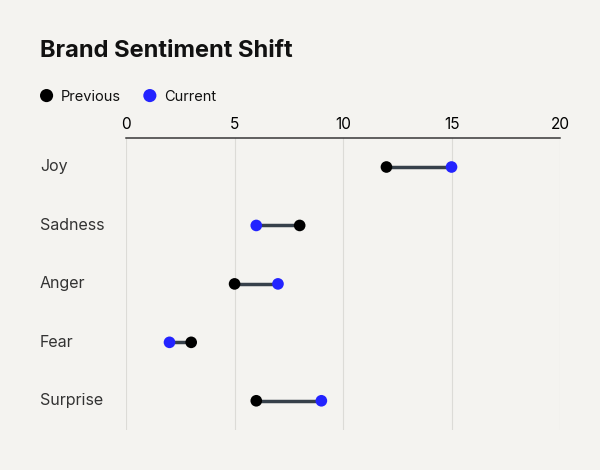
Example output for Dumbbell.