plot_geofacet()
Visualize geographic data using a grid that roughly approximates the physical map. Each state or region is rendered as a cell with text, donut, or bar indicators.
Quick Example
import pandas as pd
import clean_charts as cc

states = [
    "AK", "AL", "AR", "AZ", "CA", "CO", "CT", "DC", "DE", "FL", "GA", "HI",
    "IA", "ID", "IL", "IN", "KS", "KY", "LA", "MA", "MD", "ME", "MI", "MN",
    "MO", "MS", "MT", "NC", "ND", "NE", "NH", "NJ", "NM", "NV", "NY", "OH",
    "OK", "OR", "PA", "RI", "SC", "SD", "TN", "TX", "UT", "VA", "VT", "WA",
    "WI", "WV", "WY"
]
values = [
    42.0, 15.5, 22.0, 68.2, 98.5, 85.0, 88.4, 92.1, 74.0, 55.5, 45.0, 95.2,
    32.0, 28.5, 70.1, 35.4, 40.0, 24.5, 18.0, 94.6, 82.2, 60.0, 65.5, 58.8,
    38.0, 12.5, 20.0, 50.4, 15.0, 25.5, 72.0, 86.6, 44.4, 62.2, 96.0, 48.8,
    26.5, 90.0, 66.0, 80.5, 34.0, 22.5, 42.0, 78.5, 54.0, 76.2, 84.4, 97.5,
    52.0, 10.5, 14.0
]
df = pd.DataFrame({
    "State": states,
    "EV Adoption": values
})

cc.plot_geofacet(
    data=df,
    layout="us",
    display_type="bar",
    title="Electric Vehicle Adoption",
    subtitle="Percentage of total vehicle sales in %",
)
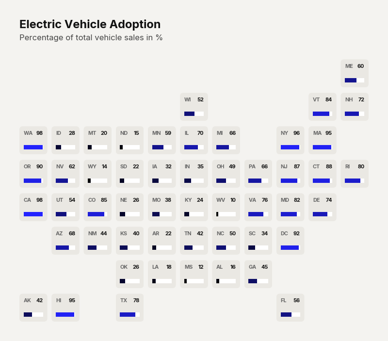
Example output for Geofacet.
Data Requirements
- DataFrame with a column of state/region abbreviations and a column of numeric values.
Parameters
| Parameter | Type | Default | Scope | Description |
|---|---|---|---|---|
data | pd.DataFrame | Built-in | Common | DataFrame with state abbreviations and values. |
output_path | str | None | None | Common | File path to save. |
width | int | None | Auto | Common | Image width in pixels. |
height | int | None | Auto | Common | Image height in pixels. |
aspect_ratio | str | None | None | Common | "square", "landscape", etc. |
title | str | None | None | Common | Bold header text. |
subtitle | str | None | None | Common | Secondary text. |
bg_color | str | None | "#f4f3f0" | Common | Background hex color. |
scale_text | bool | True | Common | Scale fonts proportionally. |
state_col | str | Auto | Unique | Column name containing location abbreviations. |
value_col | str | Auto | Unique | Column name containing numeric values. |
layout | str | "us" | Unique | Grid layout: "us", "uk". |
display_type | str | "text" | Unique | Cell render style: "text", "donut", "bar". |
max_value | float | Auto | Unique | Maximum value for scaling progress rings and bars. |
missing_color | str | Light gray | Unique | Color for states with no data. |
start_color | str | "#000000" | Unique | Heatmap gradient start color. |
end_color | str | "#2323FF" | Unique | Heatmap gradient end color. |
Common Scenarios
Donut-Style State Cells
df = pd.DataFrame({
    "State": ["CA", "TX", "NY", "FL", "IL", "PA", "OH", "GA", "NC", "MI"],
    "Goal Completion": [85, 45, 92, 38, 67, 55, 42, 60, 58, 48]
})

cc.plot_geofacet(
    data=df,
    layout="us",
    display_type="donut",
    max_value=100.0,
    title="Q3 Sales Goal Progress",
    subtitle="Percent to quota for top 10 regional markets",
    value_suffix="%",
)

Example output for Geofacet.
Heatmap Bar View
states = [
    "AK", "AL", "AR", "AZ", "CA", "CO", "CT", "DC", "DE", "FL", "GA", "HI",
    "IA", "ID", "IL", "IN", "KS", "KY", "LA", "MA", "MD", "ME", "MI", "MN",
    "MO", "MS", "MT", "NC", "ND", "NE", "NH", "NJ", "NM", "NV", "NY", "OH",
    "OK", "OR", "PA", "RI", "SC", "SD", "TN", "TX", "UT", "VA", "VT", "WA",
    "WI", "WV", "WY"
]
values = [
    42.0, 15.5, 22.0, 68.2, 98.5, 85.0, 88.4, 92.1, 74.0, 55.5, 45.0, 95.2,
    32.0, 28.5, 70.1, 35.4, 40.0, 24.5, 18.0, 94.6, 82.2, 60.0, 65.5, 58.8,
    38.0, 12.5, 20.0, 50.4, 15.0, 25.5, 72.0, 86.6, 44.4, 62.2, 96.0, 48.8,
    26.5, 90.0, 66.0, 80.5, 34.0, 22.5, 42.0, 78.5, 54.0, 76.2, 84.4, 97.5,
    52.0, 10.5, 14.0
]
df = pd.DataFrame({
    "State": states,
    "EV Adoption": values
})

cc.plot_geofacet(
    data=df,
    layout="us",
    display_type="text",
    title="Electric Vehicle Adoption",
    subtitle="Percentage of total vehicle sales in %",
    end_color="#2B0057",
    start_color="#d3a9fc"
)
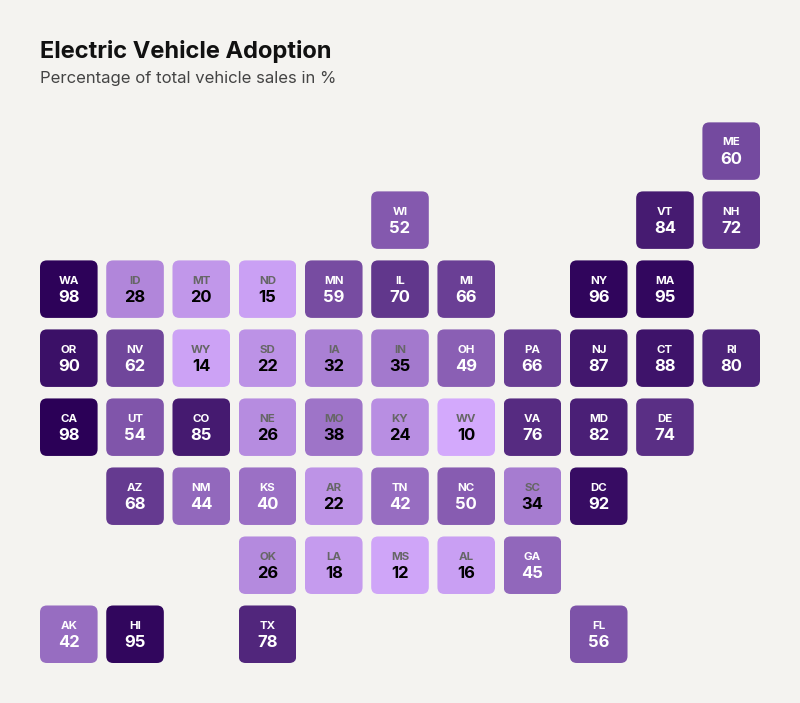
Example output for Geofacet.