plot_bubble_matrix_chart()
Plots a bubble matrix chart. Best for visualizing 3 dimensions of data (Row, Column, Size) in a grid format — useful for skill assessments, risk matrices, and performance heatmaps.
Quick Example
import pandas as pd
import clean_charts as cc

df = pd.DataFrame({
    "Generation": ["Gen Z", "Millennials", "Gen X", "Boomers"],
    "TikTok":    [95, 60, 20,  5],
    "Instagram": [85, 90, 55, 15],
    "X / Twitter":[45, 65, 40, 10],
    "LinkedIn":  [15, 75, 80, 30],
    "Facebook":  [10, 65, 85, 90]
})

cc.plot_bubble_matrix_chart(
    data=df,
    title="Social Media Demographics",
    subtitle="Estimated daily active users (in millions) by generation",
    value_suffix="m",
)
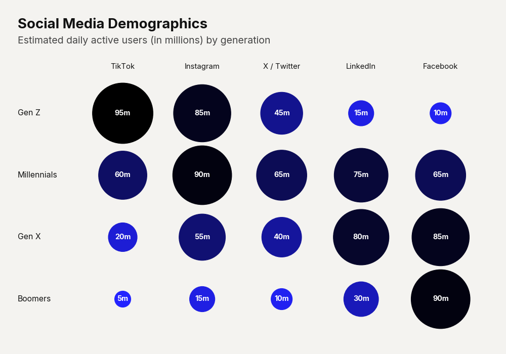
Example output for Bubble Matrix.
Data Requirements
- Column 0 — Row category labels (
str) - Columns 1…N — Numeric values. Column headers become the column labels.
Parameters
| Parameter | Type | Default | Scope | Description |
|---|---|---|---|---|
data | pd.DataFrame | Built-in | Common | First column: row labels. Remaining columns: numeric values. |
output_path | str | None | None | Common | File path to save. |
width | int | None | Auto | Common | Image width in pixels. |
height | int | None | Auto | Common | Image height in pixels. |
aspect_ratio | str | None | None | Common | "square", "landscape", etc. |
title | str | None | None | Common | Bold header text. |
subtitle | str | None | None | Common | Secondary text. |
bg_color | str | None | "#f4f3f0" | Common | Background hex color. |
scale_text | bool | True | Common | Scale fonts proportionally. |
start_color | str | "#000000" | Unique | Gradient color for lowest-value bubbles. |
end_color | str | "#2323FF" | Unique | Gradient color for highest-value bubbles. |
show_values | bool | False | Unique | Print numeric values inside each bubble. |
Common Scenarios
Risk Matrix
df = pd.DataFrame({
    "Likelihood": ["Almost Certain", "Likely", "Possible", "Unlikely", "Rare"],
    "Negligible": [2, 5,  8, 12, 15],
    "Minor":      [1, 4, 10,  8,  5],
    "Moderate":   [0, 2,  6,  4,  2],
    "Major":      [0, 1,  2,  3,  1],
    "Severe":     [0, 0,  1,  1,  0]
})

cc.plot_bubble_matrix_chart(
    data=df,
    title="Enterprise Risk Assessment",
    subtitle="Volume of identified risks by Likelihood and Impact",
    show_values=True,
    end_color="#FFA896",
    start_color="#9B1313"
)
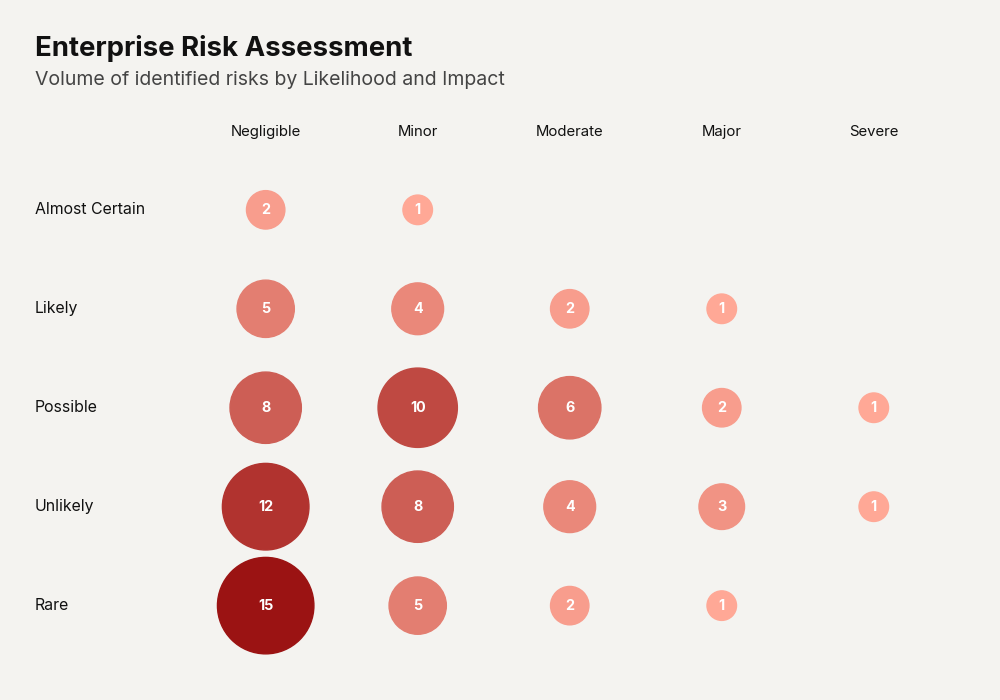
Example output for Bubble Matrix.