plot_time_series()
Plots a time-series line chart with smooth spline interpolation and inline series labels. Optimized for visualizing continuous data over time — financial metrics, user growth, performance trends.
Quick Example
import pandas as pd
import clean_charts as cc

df = pd.DataFrame({
    "Date": pd.date_range(start="2024-01-01", periods=12, freq="MS"),
    "Revenue": [120, 135, 142, 125, 155, 162, 175, 188, 185, 208, 215, 230],
    "Costs": [90, 95, 98, 105, 102, 108, 112, 118, 115, 125, 130, 135]
})

cc.plot_time_series(
    data=df,
    title="Quarterly Financials",
    subtitle="Revenue vs Costs in USD Thousands",
    label_frequency="quarter",
    value_suffix="k",
    vlines=[
        {
            "date": "2024-07-01",
            "label": "Product Launch",
            "color": "#000000"
        }
    ]
)
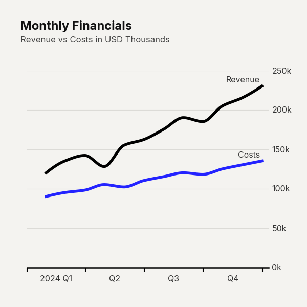
Example output for Time Series.
Data Requirements
- Time Column — must contain dates or timestamps. Auto-detected if named
"date","time", or"timestamp", or if its dtype is datetime. - Value Columns — all remaining numeric columns are plotted as independent series.
- Frequency — ideally regular intervals, though the spline interpolation handles irregular spacing.
Parameters
| Parameter | Type | Default | Scope | Description |
|---|---|---|---|---|
data |
pd.DataFrame |
Built-in | Common | DataFrame with a date column and one or more numeric series. |
output_path |
str | None |
None |
Common | File path to save the chart. |
width |
int |
600 |
Common | Image width in pixels. |
height |
int |
600 |
Common | Image height in pixels. |
aspect_ratio |
str | None |
None |
Common | "square", "landscape", "vertical", "1:1", "2:1", "1:2". |
title |
str | None |
None |
Common | Bold header text. |
subtitle |
str | None |
None |
Common | Secondary text below title. |
bg_color |
str | None |
"#f4f3f0" |
Common | Background hex color. |
scale_text |
bool |
False |
Common | Scale fonts proportionally. |
value_suffix |
str |
"" |
Common | String appended to value labels. |
start_color |
str |
"#000000" |
Unique | Hex color for the first line series. |
end_color |
str |
"#2323FF" |
Unique | Hex color for the last line series. |
label_frequency |
str |
"year" |
Unique | X-axis tick frequency: "year", "quarter", "month", "week", "day". |
markers |
bool | str |
None |
Unique | Data-point markers on lines (e.g., True, "o", "s"). |
line_labels |
str |
"name" |
Unique | Inline text near endpoints: "name", "value", "both", "none". |
smooth |
bool |
True |
Unique | Draw smooth PCHIP spline curves instead of straight segments. |
vlines |
list | dict |
None |
Unique | Vertical reference lines with optional labels. Accepts single dates, dicts, or lists of dicts. |
highlight_ranges |
list | dict |
None |
Unique | Shaded background regions between two dates. |
callouts |
list | dict |
None |
Unique | Text callout boxes pointing to specific (date, value) coordinates. Keys: date, text, series, color. |
Common Scenarios
Milestone Markers
Add vertical reference lines for key events:
df = pd.DataFrame({
    "Date": pd.date_range(start="2024-01-01", periods=12, freq="MS"),
    "Revenue": [120, 135, 142, 125, 155, 162, 175, 188, 185, 208, 215, 230],
    "Costs": [90, 95, 98, 105, 102, 108, 112, 118, 115, 125, 130, 135]
})

cc.plot_time_series(
    data=df,
    title="Quarterly Financials",
    subtitle="Revenue vs Costs in USD Thousands",
    label_frequency="quarter",
    value_suffix="k",
    vlines=[
        {
            "date": "2024-07-01",
            "label": "Product Launch",
            "color": "#000000"
        }
    ]
)
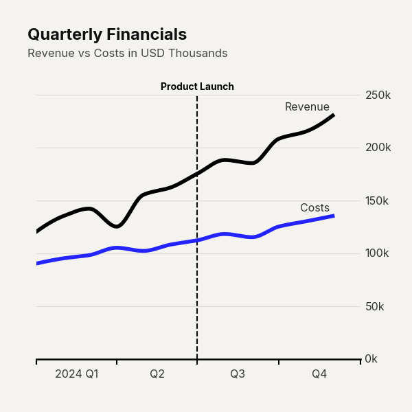
Example output for Time Series.
Recession Bands
Shade time ranges to highlight periods of interest:
df = pd.DataFrame({
    "Date": pd.date_range(start="2022-01-01", periods=24, freq="MS"),
    "Active Users": [
        1.2, 1.3, 1.4, 1.5, 1.6, 1.7,
        1.5, 1.4, 1.3, 1.2, 1.1, 1.2,
        1.3, 1.5, 1.8, 2.1, 2.4, 2.7,
        2.9, 3.1, 3.2, 3.4, 3.5, 3.7
    ]
})

cc.plot_time_series(
    data=df,
    title="Platform Active Users",
    subtitle="Monthly active users in millions",
    label_frequency="quarter",
    value_suffix="m",
    highlight_ranges=[
        {
            "start": "2022-07-01",
            "end": "2022-12-01",
            "color": "#e3120b",
            "alpha": 0.1,
            "label": "Service Outages",
            "paragraph": "A series of major infrastructure\nissues caused significant\nuser churn during this period."
        }
    ]
)
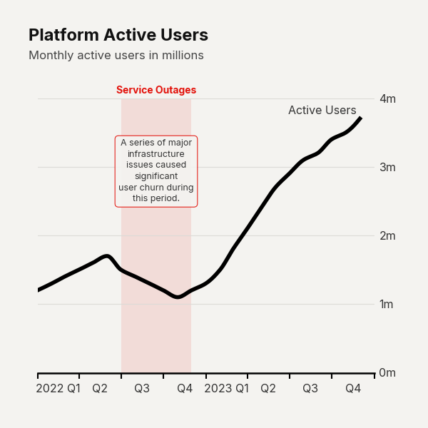
Example output for Time Series.
Data Point Callouts
Annotate specific data points:
df = pd.DataFrame({
    "Date": pd.date_range(start="2024-01-01", periods=6, freq="MS"),
    "Traffic": [210, 215, 225, 450, 280, 295]
})

cc.plot_time_series(
    data=df,
    title="Website Traffic",
    subtitle="Daily unique visitors (thousands)",
    label_frequency="month",
    value_suffix="k",
    callouts=[
        {
            "date": "2024-04-01",
            "series": "Traffic",
            "text": "Featured on HackerNews\ndriving a massive spike",
            "text_y": 50,
            "ha": "center",
            "color": "#0000CD"
        }
    ]
)
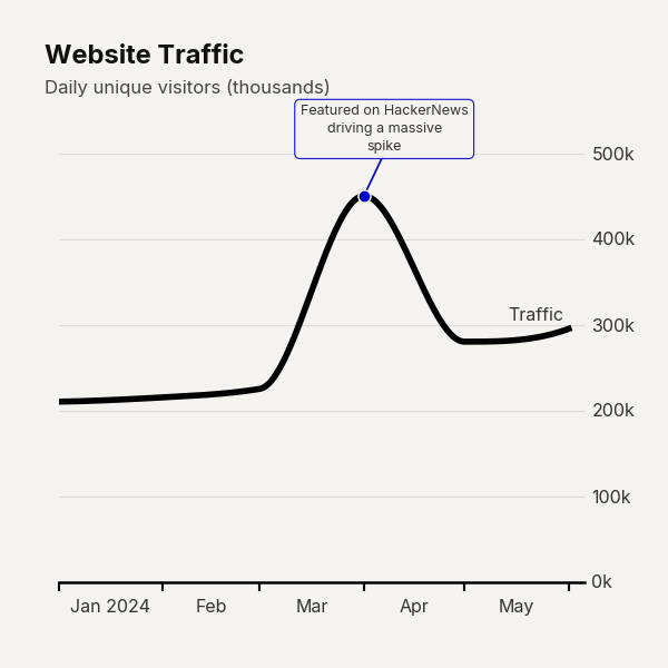
Example output for Time Series.