plot_barv_chart()
Plots a vertical bar chart in the Economist style. Best for comparing ordinal data or short-label categories like quarters, months, or single-letter codes.
Quick Example
import pandas as pd
import clean_charts as cc

df = pd.DataFrame({
    "Quarter": ["Q1", "Q2", "Q3", "Q4"],
    "Revenue": [12.5, 14.2, 11.8, 16.5]
})

cc.plot_barv_chart(
    data=df,
    title="Quarterly Revenue",
    subtitle="Vertical orientation is best for short labels or time series",
    value_suffix="M"
)
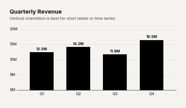
Example output for Barv.
Data Requirements
Identical to plot_barh_chart() — a 2-column DataFrame with [Category labels, Values].
Parameters
| Parameter | Type | Default | Scope | Description |
|---|---|---|---|---|
data |
pd.DataFrame |
Built-in | Common | 2-column DataFrame: [Category labels, Values]. |
output_path |
str | None |
None |
Common | File path to save the chart. |
width |
int | None |
Auto | Common | Image width in pixels. |
height |
int | None |
Auto | Common | Image height in pixels. |
aspect_ratio |
str | None |
None |
Common | "square", "landscape", "vertical", "1:1", "2:1", "1:2". |
title |
str | None |
None |
Common | Bold header text. |
subtitle |
str | None |
None |
Common | Secondary text below title. |
bg_color |
str | None |
"#f4f3f0" |
Common | Background hex color. |
scale_text |
bool |
True |
Common | Scale fonts proportionally with image size. |
value_suffix |
str |
"" |
Common | String appended to value labels. |
show_percentages |
bool |
False |
Common | Format values as percentages. |
color |
str |
"#000000" |
Unique | Hex color for all bars. |
bar_padding |
float |
0.35 |
Unique | Fraction of bar slot left as gap (0–1). |
Common Scenarios
Timeline Histogram
Visualize discrete time periods as a histogram-style chart:
df = pd.DataFrame({
    "Salary Range": ["$30k-$50k", "$50k-$70k", "$70k-$90k", "$90k-$110k", "$110k-$130k", "$130k+"],
    "Employees": [45, 120, 210, 150, 60, 15]
})

cc.plot_barv_chart(
    data=df,
    aspect_ratio="2:1",
    title="Company Salary Distribution",
    subtitle="Number of employees per salary bracket",
    bar_padding=0,
)
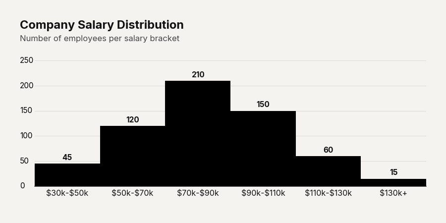
Example output for Barv.
Square Tile
Compact square aspect ratio for dashboard panels:
df = pd.DataFrame({"Quarter": ["Q1", "Q2", "Q3", "Q4"], "Revenue": [12.5, 14.2, 11.8, 16.5]})

cc.plot_barv_chart(
    data=df,
    title="Quarterly Revenue",
    aspect_ratio="square",
    bar_padding=0.4
)
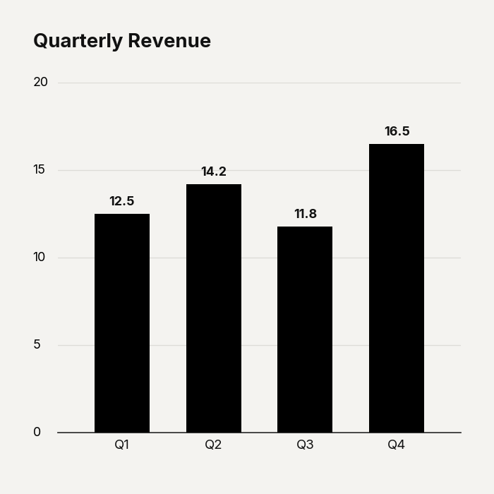
Example output for Barv.