plot_stacked_bar_chart()
Plots a stacked horizontal bar chart. Best for showing part-to-whole relationships across categories, such as revenue composition by segment or survey response distributions.
Quick Example
import pandas as pd
import clean_charts as cc

df = pd.DataFrame({
    "Quarter": ["Q1 2024", "Q2 2024", "Q3 2024", "Q4 2024"],
    "Enterprise": [120, 135, 142, 160],
    "SMB": [80, 85, 95, 110],
    "Consumer": [45, 48, 52, 65]
})
cc.plot_stacked_bar_chart(
    data=df,
    title="Quarterly Revenue Growth",
    subtitle="Revenue breakdown by customer segment (in millions)",
    value_suffix="M",
    bar_labels="value"
)
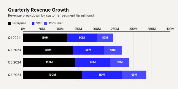
Example output for Stacked Bar.
Data Requirements
- Column 0 — Category labels (
str) - Columns 1…N — Numeric values for each stacked series. Column headers become legend labels.
Parameters
| Parameter | Type | Default | Scope | Description |
|---|---|---|---|---|
data |
pd.DataFrame |
Built-in | Common | First column: category labels. Subsequent columns: numeric series. |
output_path |
str | None |
None |
Common | File path to save the chart. |
width |
int | None |
Auto | Common | Image width in pixels. |
height |
int | None |
Auto | Common | Image height in pixels. |
aspect_ratio |
str | None |
None |
Common | "square", "landscape", "vertical", "1:1", "2:1", "1:2". |
title |
str | None |
None |
Common | Bold header text. |
subtitle |
str | None |
None |
Common | Secondary text below title. |
bg_color |
str | None |
"#f4f3f0" |
Common | Background hex color. |
scale_text |
bool |
True |
Common | Scale fonts proportionally. |
value_suffix |
str |
"" |
Common | String appended to value labels. |
show_percentages |
bool |
False |
Common | Format values as percentages. |
colors |
list[str] |
Auto | Unique | Explicit list of hex colors for the stacked series. |
start_color |
str |
"#000000" |
Unique | Gradient start color. Overrides colors. |
end_color |
str |
"#2323FF" |
Unique | Gradient end color. Overrides colors. |
bar_padding |
float |
0.35 |
Unique | Fraction of bar slot left as whitespace (0–1). |
bar_labels |
str |
"none" |
Unique | Labels on each segment: "none", "value", "name", "both". |
Common Scenarios
100% Normalized Stack
Show proportional distribution with percentage labels:
df = pd.DataFrame({
    "Country": ["France", "Sweden", "Germany", "USA", "China", "India"],
    "Fossil Fuels": [45, 12, 230, 2450, 5200, 1150],
    "Nuclear": [350, 55, 32, 780, 410, 45],
    "Renewables": [120, 115, 260, 950, 2400, 310]
})

cc.plot_stacked_bar_chart(
    data=df,
    title="The Global Energy Mix",
    subtitle="Share of total electricity generation by source",
    show_percentages=True,
    bar_labels="value",
    aspect_ratio="landscape"
)
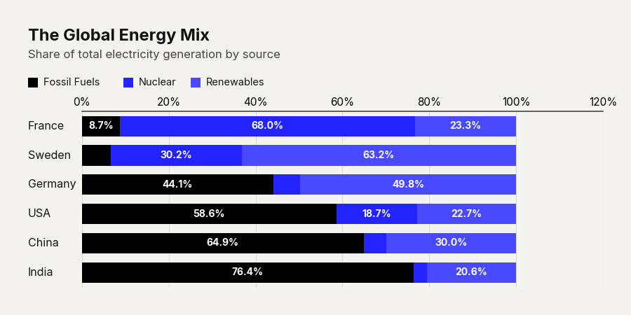
Example output for Stacked Bar.
Custom Color Palette
Use brand colors for each segment:
df = pd.DataFrame({
    "Year": ["2021", "2022", "2023", "2024"],
    "Our Brand": [15, 22, 35, 48],
    "Competitor A": [45, 40, 32, 25],
    "Competitor B": [40, 38, 33, 27]
})

cc.plot_stacked_bar_chart(
    data=df,
    title="Market Share Takeover",
    subtitle="Our brand vs top competitors",
    aspect_ratio="1:1",
    colors=["#E40078", "#4B5563", "#9CA3AF"],
    show_percentages=True,
    bar_labels="value",
    bar_padding=0.5
)
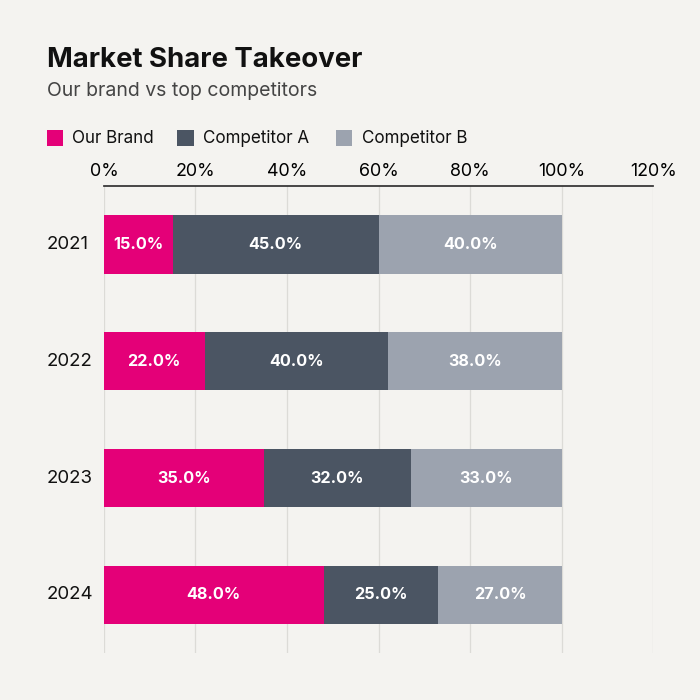
Example output for Stacked Bar.