plot_table()
Plots an Economist-style data table using Matplotlib primitives. Supports multi-index DataFrames, column-level configuration, cell-level styling, and rule-based conditional highlighting.
Quick Example
import pandas as pd
import clean_charts as cc

df = pd.DataFrame({
    "Company": ["Apple", "Microsoft", "Google", "Amazon", "Meta"],
    "Revenue (B)": ["$394.3B", "$211.9B", "$307.4B", "$574.8B", "$134.9B"],
    "YoY Growth": ["+2.0%", "+15.8%", "+8.7%", "+11.8%", "+15.7%"],
    "Market Cap (T)": ["$3.44T", "$3.12T", "$2.17T", "$1.87T", "$1.27T"]
})

cc.plot_table(
    data=df,
    title="Big Tech financial Snapshot",
    subtitle="Fiscal year 2024 results",
    options={"rowLabelWidthPct": 0.25}
)
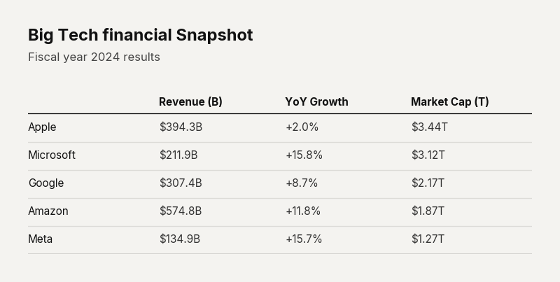
Example output for Table.
Data Requirements
pd.DataFrameorlistof rows. SupportsMultiIndexfor grouped row headers.
Parameters
| Parameter | Type | Default | Scope | Description |
|---|---|---|---|---|
data | pd.DataFrame | list | Built-in | Common | Tabular data to plot. Supports MultiIndex. |
output_path | str | None | None | Common | File path to save. |
width | int | None | Auto | Common | Image width in pixels. |
height | int | None | Auto | Common | Image height in pixels. |
aspect_ratio | str | None | None | Common | "square", "landscape", etc. |
title | str | None | None | Common | Bold header text. |
subtitle | str | None | None | Common | Secondary text. |
bg_color | str | None | "#f4f3f0" | Common | Background hex color. |
scale_text | bool | True | Common | Scale fonts proportionally. |
columns | list[dict] | Auto | Unique | Column-specific configs (width, alignment, format). |
cellStyles | dict | None | Unique | Per-cell styling by (row_idx, col_idx) key. |
highlightRules | list[dict] | None | Unique | Auto-highlight rules: ranges, callables, positive-negative coloring. |
Common Scenarios
Conditional Heatmap
Highlight cells based on value ranges:
df = pd.DataFrame({
    "Region": ["North", "South", "East", "West"],
    "Revenue (B)": [45.2, 38.1, 52.7, 41.3],
    "Growth (%)": [12.3, -5.2, 18.1, 8.7],
    "Margin (%)": [1, 18.2, 31.0, 22.8]
})

cc.plot_table(
    data=df,
    title="Performance Matrix",
    options={"rowLabelWidthPct": 0.25},
    highlightRules=[
        {"col": 1, "condition": "positive-negative"},
        {"col": 2, "condition": "range",
        "min_color": "#FF2C2C", "max_color": cc.config.BACKGROUND_COLOR,
        "min": 18.2, "max": 31}
    ]
)
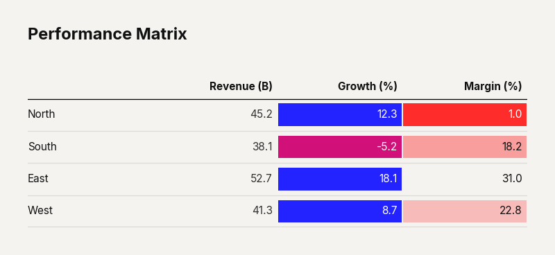
Example output for Table.
Custom Column Widths
df = pd.DataFrame({
    "Region": ["North", "South", "East", "West"],
    "Revenue (B)": [45.2, 38.1, 52.7, 41.3],
    "Growth (%)": [12.3, -5.2, 18.1, 8.7],
    "Margin (%)": [1, 18.2, 31.0, 22.8]
})

cc.plot_table(
    data=df,
    columns=[
        {"name": "Revenue", "width_pct": 0.25, "align": "right"},
        {"name": "Growth", "width_pct": 0.25, "align": "right"},
        {"name": "Margin", "width_pct": 0.25, "align": "right"}
    ]
)
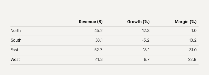
Example output for Table.