plot_waffle_chart()
Plots a multi-category waffle chart (10×10 dot grids) in the Economist style. Best for displaying precise grid proportions — “X out of 100” — in a visually striking format.
Quick Example
import pandas as pd
import clean_charts as cc

df = pd.DataFrame({
    "Heading": ["Growth Focus", "Resource Allocation", "Customer Centricity"],
    "Description": [
        "Organizations focusing 30% or more of their time on long-term growth initiatives",
        "Companies that actively increase resourcing during periods of market volatility",
        "Firms that consistently incorporate direct customer input into business decisions"
    ],
    "Value": [29, 30, 15]
})

cc.plot_waffle_chart(
    data=df,
    height=500,
    title="Key Strategic Priorities",
    subtitle="Percentage of surveyed organizations reporting on key focus areas",
    value_suffix="%"
)
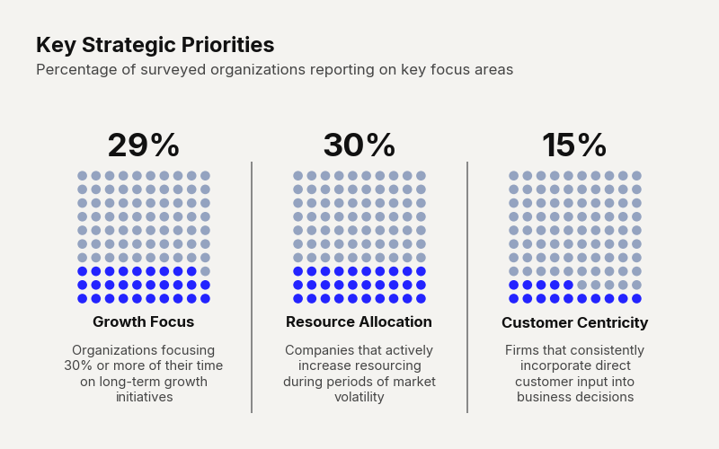
Example output for Waffle.
Data Requirements
- 2 columns — [Category, Percentage]
- 3 columns — [Label (optional grouping), Category, Percentage]
Parameters
| Parameter | Type | Default | Scope | Description |
|---|---|---|---|---|
data | pd.DataFrame | Built-in | Common | 2 or 3-column DataFrame. |
output_path | str | None | None | Common | File path to save. |
width | int | None | Auto | Common | Image width in pixels. |
height | int | None | Auto | Common | Image height in pixels. |
aspect_ratio | str | None | None | Common | "square", "landscape", etc. |
title | str | None | None | Common | Bold header text. |
subtitle | str | None | None | Common | Secondary text. |
bg_color | str | None | "#f4f3f0" | Common | Background hex color. |
scale_text | bool | True | Common | Scale fonts proportionally. |
color | str | "#000000" | Unique | Hex color for filled dots. |
inactive_color | str | Light gray | Unique | Hex color for unfilled dots. |
Common Scenarios
Budget Allocation
df = pd.DataFrame({
    "Department": ["Manufacturing", "Engineering", "Operations", "Sales"],
    "Training Requirement": [
        "Heavy machinery and floor safety protocols",
        "Laboratory and electrical hazard compliance",
        "Logistics, warehouse, and lifting safety",
        "Standard office compliance and cybersecurity"
    ],
    "Completion (%)": [82, 94, 76, 98]
})

cc.plot_waffle_chart(
    data=df,
    title="Departmental Safety & Compliance Training",
    subtitle="Share of employees who have completed required annual certifications",
    value_suffix="%",
    color="#0066cc",          # Custom filled dot color (optional)
)
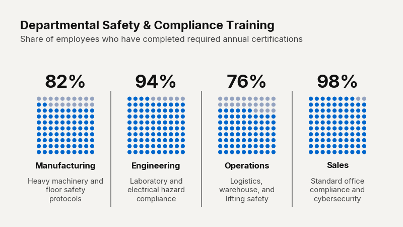
Example output for Waffle.