plot_grouped_barh_chart()
Plots a grouped horizontal bar chart. Best for comparing multiple subgroups across several primary categories — e.g., revenue by product line across regions.
Quick Example
import pandas as pd
import clean_charts as cc

df = pd.DataFrame({
    "Region": ["North America", "Europe", "Asia Pacific"],
    "2022": [45, 38, 52],
    "2023": [52, 42, 58]
})

cc.plot_grouped_barh_chart(
    data=df,
    title="Average Revenue by Region",
    subtitle="in millions of USD",
    value_suffix="M"
)
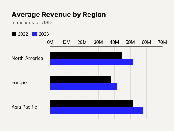
Example output for Grouped Barh.
Data Requirements
- Column 0 — Category labels (
str) - Columns 1…N — Numeric values for each series. Column headers become the legend labels.
Parameters
| Parameter | Type | Default | Scope | Description |
|---|---|---|---|---|
data |
pd.DataFrame |
Built-in | Common | First column: category labels. Subsequent columns: numeric series. |
output_path |
str | None |
None |
Common | File path to save the chart. |
width |
int | None |
Auto | Common | Image width in pixels. |
height |
int | None |
Auto | Common | Image height in pixels. |
aspect_ratio |
str | None |
None |
Common | "square", "landscape", "vertical", "1:1", "2:1", "1:2". |
title |
str | None |
None |
Common | Bold header text. |
subtitle |
str | None |
None |
Common | Secondary text below title. |
bg_color |
str | None |
"#f4f3f0" |
Common | Background hex color. |
scale_text |
bool |
True |
Common | Scale fonts proportionally. |
value_suffix |
str |
"" |
Common | String appended to value labels. |
show_percentages |
bool |
False |
Common | Format values as percentages. |
start_color |
str |
"#000000" |
Unique | Hex color for the first series (gradient start). |
end_color |
str |
"#2323FF" |
Unique | Hex color for the last series (gradient end). |
bar_padding |
float |
0.35 |
Unique | Fraction of a single bar slot left as whitespace (0–1). |
group_padding |
float |
Auto | Unique | Fraction of the group height used as spacing between groups. |
bar_labels |
str |
"none" |
Unique | Controls labels drawn on each bar: "none", "value", "name", "both". |
group_comments |
list[dict] |
None |
Unique | Per-group annotations in the label region. Keys: heading, subtitle, big_number. |
group_separators |
bool |
False |
Unique | Draw thin horizontal lines between adjacent groups. |
Common Scenarios
Scorecard with Group Comments
Add big-number annotations alongside each group:
df = pd.DataFrame({
    "Sector": ["Cloud Infrastructure", "Digital Advertising", "Consumer Hardware", "Subscription Services"],
    "Q4,2023": [115, 205, 310, 85],
    "Q4,2024": [158, 235, 290, 112]
})

cc.plot_grouped_barh_chart(
    data=df,
    title="Tech Sector Revenue Shifts",
    subtitle="Global revenue comparison in billions (USD)",
    group_comments=[
        {
            "heading": "Cloud Infrastructure",
            "subtitle": "AI workloads driving explosive growth",
            "big_number": "+37%"
        },
        {
            "heading": "Digital Advertising",
            "subtitle": "Ad spend rebounded strongly in Q4",
            "big_number": "+15%"
        },
        {
            "heading": "Consumer Hardware",
            "subtitle": "Impacted by global supply constraints",
            "big_number": "-6%"
        },
        {
            "heading": "Subscription Services",
            "subtitle": "High retention despite price hikes",
            "big_number": "+32%"
        }
    ],
    group_separators=True,
    value_suffix="B",
    bar_labels="value"
)
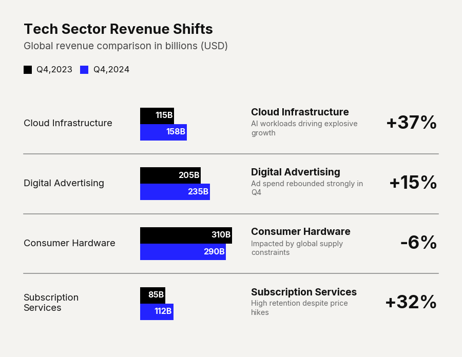
Example output for Grouped Barh.
Gradient Heat
Use a gradient to encode series rank visually:
df = pd.DataFrame({
    "Product": ["Enterprise Suite", "Pro Edition", "Basic Plan", "Free Tier"],
    "High Satisfaction": [72, 65, 45, 38],
    "Neutral": [20, 25, 35, 42],
    "Low Satisfaction": [8, 10, 20, 20]
})

cc.plot_grouped_barh_chart(
    data=df,
    title="Customer Satisfaction by Product Tier",
    subtitle="Gradient colors reinforce the sentiment hierarchy",
    start_color="#000044",
    end_color="#0044CD",
    group_padding=0.25,
    value_suffix="%",
    bar_labels="value"
)
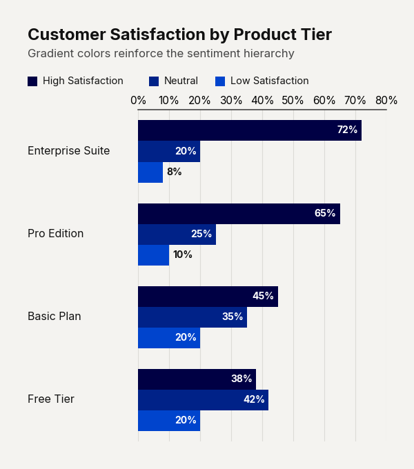
Example output for Grouped Barh.