plot_donut_chart()
Renders a donut (ring) chart with a hollow center for displaying summary text. Designed for part-of-whole compositions with up to ~8 segments. Each segment is colored with a continuous gradient.
Quick Example
import pandas as pd
import clean_charts as cc

df = pd.DataFrame({
    "Source": ["Solar", "Wind", "Nuclear", "Natural Gas", "Coal"],
    "TWh": [1200, 1500, 2500, 3000, 1800]
})

cc.plot_donut_chart(
    data=df,
    title="Global Energy Mix",
    subtitle="Projected generation in 2030 (TWh)",
    center_label="10,000\nTWh"
)
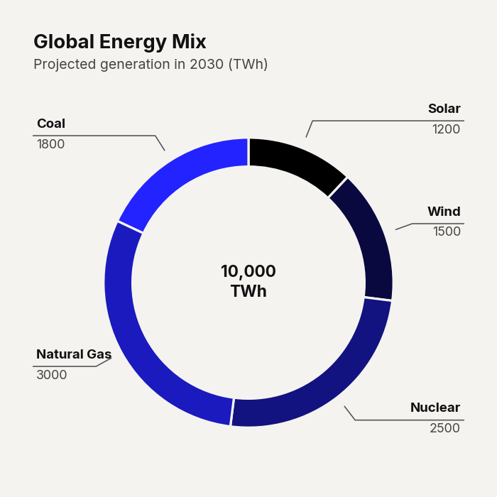
Example output for Donut.
Data Requirements
- Column 0 — Segment labels (
str) - Column 1 — Numeric values (auto-normalized to percentages)
Parameters
| Parameter | Type | Default | Scope | Description |
|---|---|---|---|---|
data | pd.DataFrame | Built-in | Common | 2-column DataFrame: [Labels, Values]. |
output_path | str | None | None | Common | File path to save. |
width | int | None | 600 | Common | Image width in pixels. |
height | int | None | Auto | Common | Image height in pixels. |
aspect_ratio | str | None | None | Common | "square", "landscape", etc. |
title | str | None | None | Common | Bold header text. |
subtitle | str | None | None | Common | Secondary text. |
bg_color | str | None | "#f4f3f0" | Common | Background hex color. |
scale_text | bool | True | Common | Scale fonts proportionally. |
value_suffix | str | "" | Common | String appended to legend values. |
show_percentages | bool | False | Common | Append percentage to legend labels. |
start_color | str | "#000000" | Unique | Gradient start color for the first segment. |
end_color | str | "#2323FF" | Unique | Gradient end color for the last segment. |
center_label | str | None | None | Unique | Bold text inside the ring center. Use \n for multiline (e.g., "$42M\nTotal"). |
hole_radius | float | Auto | Unique | Inner hole as fraction of outer radius (0–1). |
start_angle | float | 90 | Unique | Angle (degrees) to start drawing the first wedge. |
donut_radius | float | Auto | Unique | Outer radius as fraction of available chart height. |
Common Scenarios
Hero Metric Donut
df = pd.DataFrame({
    "Source": ["Solar", "Wind", "Nuclear", "Natural Gas", "Coal"],
    "TWh": [1200, 1500, 2500, 3000, 1800]
})

cc.plot_donut_chart(
    data=df,
    title="Revenue Breakdown",
    center_label="$42M\nTotal Revenue",
    show_percentages=True
)
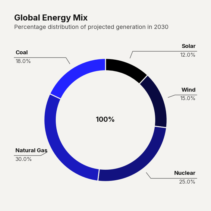
Example output for Donut.
Custom Gradient
df = pd.DataFrame({
    "Source": ["Solar", "Wind", "Nuclear", "Natural Gas", "Coal"],
    "TWh": [1200, 1500, 2500, 3000, 1800]
})

cc.plot_donut_chart(
    data=df,
    title="Revenue Breakdown",
    center_label="$42M\nTotal Revenue",
    show_percentages=True,
    start_color="#0A1F13",
    end_color="#FFED29"
)
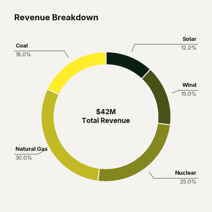
Example output for Donut.